Menu Redesign
Simplifying and reorganizing CNBC’s mobile app Menu — while also improving clarity, streamlining how users interact with it, and showing features that matter most.
Scroll to explore

Background
The legacy app menu presented major usability challenges, relying on a long scroll and lacking consistent organization or clear labels. Our team set out to redesign this experience with a focus on clarity, structure, and customization.
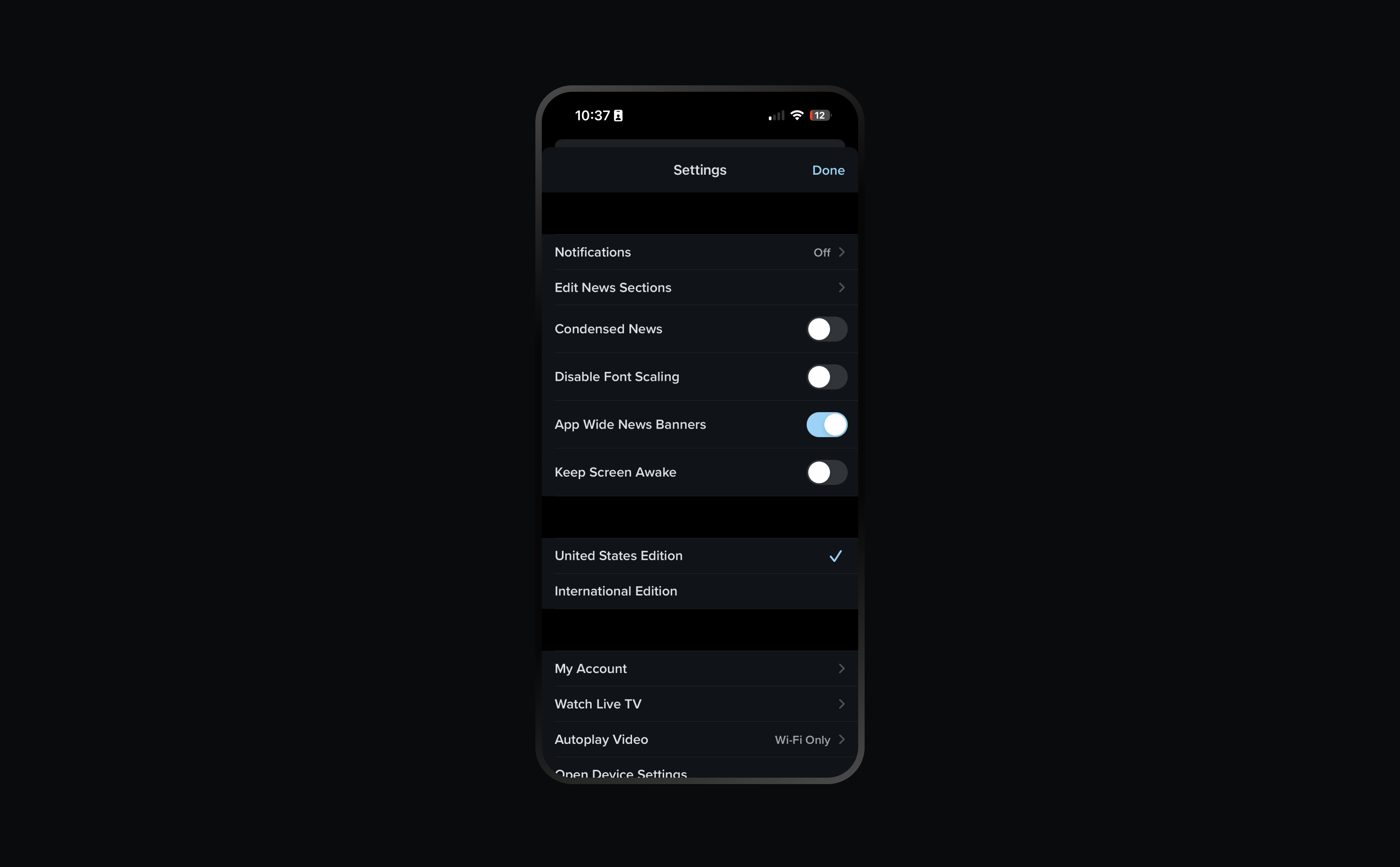
Approach
Competitive research was done on how other brand organize their menus. Information was reorganized to prioritize frequently accessed items and grouped into logical sections based on shared functionality and user behavior patterns.
Findings
Users responded positively to the new organizational structure.
The menu remained visually dense, with long scrolling, making quick navigation difficult.
Users felt the menu lacked a sense of personal relevance—describing it as “informative, but impersonal”.

Ideation
As part of ideation, we explored layouts that fit the screen and eliminated the need for scrolling, aiming to present all essential menu elements at a glance. Dedicated sections were added to spotlight personalized features, better aligning user expectations with business objectives such as feature adoption and content discovery.
Findings
Fitting the menu onto a single screen and the combination of icons with clear labels reinforced the information hierarchy, reducing friction.
Users struggled to locate less prominent tools, leading to confusion about where certain features were located.
Results
The result was a robust new menu that not only streamlined navigation but also allowed users to personalize their profile, enabling better control over the news and content they care about most.
“Now I have a dedicated section to come back and read my saved articles”

CNBC Projects
01.
CNBC+
CNBC+

New Product
02.
Home Feed
Home Feed

Navigation
